Digital
Creative Direction & Design
Building Connected Brand Experiences Across Digital Touchpoints
The Challenge
Brands today don’t live in one place anymore. They exist across websites, social platforms, mobile screens, and constantly shifting digital environments. Each of those touchpoints carries the same responsibility: to express the brand clearly, consistently, and with intention.
The challenge in this work was fragmentation. Websites felt disconnected from social campaigns. UI systems didn’t always translate cleanly into marketing moments. Website takeovers and social activations often existed as one-off executions rather than part of a larger, cohesive design language.
The goal was to create digital experiences that didn’t just look consistent, but actually felt like they belonged to the same system, regardless of where or how they showed up.
The Approach
The starting point was thinking less about individual deliverables and more about a connected ecosystem.
Instead of treating websites, UI/UX, social campaigns, and takeovers as separate projects, the work was approached as one continuous brand experience that simply changed shape depending on context.
A responsive website might act as the foundation. Social campaigns extend that story in shorter, more immediate bursts. Website takeovers become high-impact moments of disruption and focus. UI/UX systems quietly carry the structure underneath it all.
The idea wasn’t to force everything into a rigid template, but to establish a flexible design language that could stretch and contract while still feeling unmistakably consistent.
Design Decisions
A few key principles guided the system:
Clarity over decoration. Every layout decision prioritized readability, hierarchy, and intent. Visual elements existed to support the message, not overwhelm it.
Modularity. Components were designed to be reused and reconfigured across platforms. This allowed campaigns to scale without losing coherence.
Motion with purpose. Animation and transitions were used to guide attention and create rhythm, not just for visual flair.
Context awareness. A responsive website behaves differently than a social post or takeover, but all three share the same underlying logic, tone, and structure.
Typography and grid systems acted as the connective tissue. They provided stability across unpredictable formats, ensuring that whether a user was scrolling on mobile or engaging with a full-screen digital takeover, the experience still felt like part of the same world.
Execution Across Platforms
Responsive Websites
Web experiences were built to adapt fluidly across devices while maintaining strong narrative structure. Content hierarchy was carefully designed to guide users through information without friction.
UI/UX
Interface systems focused on usability and clarity. Every interaction was considered in terms of behavior, feedback, and ease of navigation, creating experiences that felt intuitive rather than instructional.
Website Takeovers
Takeovers were treated as moments of intensity within the broader system. High-impact visuals and focused messaging created interruption points that still felt aligned with the brand rather than disruptive noise.
Social Media Campaigns
Social content translated the larger system into fast, digestible formats. While shorter in form, these moments maintained the same tone, visual language, and narrative intent as the broader ecosystem.
The Outcome
The result was a more unified digital presence where every touchpoint reinforced the same brand experience rather than competing versions of it.
Instead of fragmented campaigns and disconnected executions, the work created a flexible system that could evolve across platforms while maintaining consistency, clarity, and personality.
More importantly, it allowed the brand to feel present everywhere without feeling repetitive anywhere. Each expression was different in form, but connected in language, structure, and intent.
The end result wasn’t just a set of digital deliverables. It was a cohesive creative system built to scale across the way people actually experience brands today.
SCROLL DOWN TO SEE MORE
Video Direction
Concept Development, Direction & Final Cut Approval
The Challenge
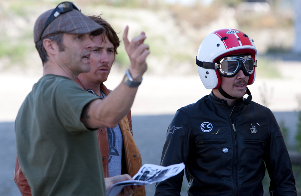
The most successful brand films don’t feel like advertisements. They feel like moments you’ve stepped into, where story, craft, and culture all carry equal weight.
The challenge in this work was to consistently bridge that gap between idea and execution. Not just producing video content, but building films with a clear point of view from the first concept through to final cut.
Too often, video projects start strong but lose clarity along the way. The original intent gets softened through production layers, feedback cycles, and post-production compromises. The result is something polished, but emotionally flat.
This work was about protecting the idea all the way through.
The Approach
Every project began with concept development grounded in a simple question: what is this story really trying to say, and why does it need to exist as a film?
From there, direction became about building a structure that could hold that idea without overcomplicating it.
The process treated video as a connected system rather than separate stages. Concept development, on-set direction, editorial decisions, and final cut approval were all part of one continuous creative thread.
That continuity mattered. It ensured that what was imagined early on stayed intact through production and post, rather than being reshaped by external noise or disconnected decision-making.
The goal was always the same: clarity of intent over excess of execution.
Creative Decisions
A few guiding principles shaped the work across projects:
Story as the foundation. Every creative decision was measured against whether it strengthened the narrative. If it didn’t serve the story, it wasn’t necessary.
Restraint in execution. Strong ideas don’t need constant reinforcement. Allowing space, silence, and pacing often created more impact than over-layering visuals or effects.
Real environments over constructed ones. Whenever possible, filming in authentic locations helped ground the work in reality. Texture, imperfection, and natural light became part of the visual language.
Pacing as structure. Editing wasn’t just assembly, it was design. Rhythm, timing, and flow shaped how the audience experienced the story emotionally.
Consistency across stages. The same creative logic carried from concept boards through production decisions to final edit approval, ensuring the original intent stayed visible in the finished piece.
Execution
Each project followed a connected three-stage process:
Concept Development
Ideas were shaped around a clear narrative core, supported by visual direction, tone references, and structural thinking. This stage defined what the film needed to communicate before anything was shot.
Direction
On set, the focus shifted to translation rather than reinvention. The role of direction was to protect the idea while staying responsive to real moments that elevated the story.
Final Cut Approval
Post-production became the final layer of authorship. Editing, pacing, sound, and color were refined until the film felt aligned with the original intent and emotionally complete.
The Outcome
The result was a body of work where the distance between concept and final output was intentionally minimal.
Each film carried a clear narrative voice, supported by grounded visuals and disciplined pacing. Rather than feeling like isolated pieces of content, the work felt connected through a consistent approach to storytelling and creative control.
By treating video as an end-to-end design discipline, the final work maintained clarity, emotional weight, and cohesion from first idea to final frame.
What remained was not just a series of finished films, but a repeatable way of building stories that hold their shape all the way through production.
Photo shoots
Creative Direction & Concept Development
Photo Shoots as World-Building for Brand Storytelling
The Challenge
Photography for brands often gets reduced to a simple output: capture products, stage talent, deliver assets.
But that approach misses the bigger opportunity.
The real challenge in this work was not just producing strong imagery, but creating photo shoots that felt like complete visual worlds. Every shoot needed to do more than document a moment. It had to express a point of view, reinforce a brand story, and feel consistent across campaign, digital, and social use.
Without a clear creative system, photo shoots can quickly become fragmented. Different locations, different photographers, different moods. The result is often a disconnected set of images that don’t feel like they belong to the same narrative.
The goal was to bring structure, intention, and storytelling into every stage of the process.
The Approach
Each project began long before the camera was ever turned on.
The foundation was always concept development. Not just deciding what to shoot, but defining what the shoot needed to mean. This meant identifying the emotional tone, cultural references, visual language, and narrative direction that would guide every decision.
From there, creative direction became about building a complete system around that idea:
Location selection that supported the story, not just aesthetics
Casting that reflected authentic personality, not just appearance
Styling that reinforced the world being built
Shot planning that ensured narrative continuity across assets
Rather than treating photography as isolated execution, it was approached as world-building. Every shoot was an opportunity to create a contained visual universe that could expand across digital platforms, campaigns, and brand touchpoints.
Creative Decisions
A few core principles shaped the work:
Story before style. Strong imagery starts with clarity of concept. Visual decisions were always grounded in narrative intent rather than trends or surface aesthetics.
Real environments over artificial perfection. Wherever possible, shoots leaned into lived-in locations. Texture, imperfection, and natural light helped ground the work in reality and make it feel more believable.
Intentional casting. People weren’t chosen just for how they looked, but for how they embodied the world being created. Presence mattered more than pose.
Cohesive visual systems. Every shoot was designed to generate a consistent set of assets that could live across website, social, print, and campaign environments without losing its identity.
On-set direction as storytelling. The shoot itself was treated as a live editorial process. Adjustments were made in real time to protect the concept and elevate unexpected moments that strengthened the narrative.
Execution
The creative direction process typically followed three stages:
Concept Development
Defining the story, tone, and visual language. This stage established the emotional and cultural foundation of the shoot before anything was produced.
Shoot Direction
On set, the focus shifted to execution without losing flexibility. The role was to guide energy, refine composition, and ensure every frame aligned with the original concept while remaining open to moments that added authenticity.
Asset Shaping
After the shoot, imagery was curated and refined into a cohesive system. The final output wasn’t just a selection of photos, but a structured visual library designed to work across multiple applications.
The Outcome
The result was a more intentional approach to photography where every shoot functioned as a complete narrative system rather than a collection of isolated images.
Each project produced imagery that felt connected, consistent, and emotionally grounded, with enough flexibility to live across digital, social, and campaign environments.
More importantly, the work shifted photo shoots from executional tasks into strategic creative moments. Instead of simply capturing what a brand looks like, the process focused on defining how it feels, how it behaves, and how it exists within culture.
The outcome was photography that didn’t just show the brand. It built its world.
Environmental
Creative Direction, Design & Project Management
Environmental Design Systems
The Challenge
Environmental design work sits at a difficult intersection. It has to communicate clearly in physical space, hold up under real-world conditions, and still feel like a cohesive extension of a brand.
The challenge in this work was scale and complexity. Unlike a single campaign or digital experience, environmental design operates across many variables at once: location, materials, wayfinding, signage systems, human behavior, and brand expression in three-dimensional space.
Without a strong creative and structural framework, these projects can quickly become inconsistent. Different vendors interpret the system differently. Materials drift. Messaging loses clarity. The end result feels fragmented instead of intentional.
The goal was to create environmental systems that felt unified, legible, and emotionally connected to the brand, while still being practical enough to execute across real-world constraints.
The Approach
The work began by treating environmental design less like decoration and more like infrastructure.
Every project started with a clear conceptual foundation: what should people feel, understand, or do when they move through this space?
From there, the process expanded into system thinking. Instead of designing isolated touchpoints, the focus was on creating a connected language that could scale across physical environments.
This included:
Spatial storytelling that guided movement and attention
Hierarchical messaging systems for clarity at distance and close range
Material choices that reinforced tone and durability
Modular design components that could adapt to different environments without losing consistency
A key part of the approach was recognizing that environmental design is experienced in motion. Unlike static media, people engage with it while walking, pausing, observing, and interacting. That meant pacing, sightlines, and sequencing became as important as visual design itself.
Creative Decisions
A few core principles shaped the work:
Clarity first. Environmental graphics need to be understood instantly. Typography, contrast, and layout were always optimized for legibility at scale and speed.
System over object. Instead of designing one-off visuals, the focus was on building repeatable components that could flex across different applications and environments.
Material awareness. Physical execution mattered as much as visual design. Surfaces, textures, lighting conditions, and installation methods all influenced final decisions.
Human movement as structure. Layouts were designed based on how people actually move through space, not how compositions look on a screen.
Consistency under variation. Even when environments differed significantly, the underlying system ensured that every execution felt like part of the same brand world.
Project Management & Execution
A critical part of this work was managing complexity across disciplines.
Environmental projects require coordination between creative direction, production teams, fabricators, installers, and stakeholders. Maintaining clarity through that process was essential.
The role extended beyond design into project stewardship:
Translating creative intent into buildable specifications
Ensuring consistency across vendors and production partners
Reviewing fabrication details to protect design integrity
Aligning stakeholders around a shared visual and experiential outcome
This structure helped ensure that what was designed on screen could be faithfully executed in physical space without losing intent or quality.
The Outcome
The result was a more cohesive and intentional approach to environmental design, where physical spaces felt like extensions of a unified brand system rather than disconnected executions.
Each project functioned as part of a larger visual language that could adapt to scale, location, and context while maintaining clarity and emotional consistency.
More importantly, the work demonstrated that environmental design is not just about graphics in space. It is about shaping how people move through, understand, and experience a brand in the real world.
The outcome was not only better-looking environments, but more meaningful ones, built on a foundation of systems thinking, creative direction, and disciplined project management.
Identity
Creative Direction & Design
Identity Systems That Shape How Brands Are Seen and Remembered
The Challenge
Brand identity work sits at the core of how a company is perceived, yet it’s often misunderstood as just a logo or visual refresh.
The real challenge in this discipline is consistency under complexity. A brand has to live across dozens of touchpoints—digital platforms, physical environments, packaging, campaigns, internal communications—and still feel like one unified voice.
Without a strong system, identity becomes fragmented. Different teams interpret it differently. Visual language drifts. Messaging loses clarity. Over time, the brand stops feeling intentional and starts feeling improvised.
The goal in this work was to build identity systems that hold their shape across every application while still allowing room for expression, evolution, and cultural relevance.
The Approach
The process began by defining identity as the brands overall personality rather than a single artifact.
Instead of starting with visuals, the work started with intent. What does the brand stand for? How should it behave? How should it feel in different contexts—formal, cultural, digital, physical?
From there, design became a translation layer between strategy and experience.
Each identity system was built to function across three levels:
A core visual language that establishes recognition
A flexible system that adapts across applications
A set of principles that guide decision-making over time
This structure allowed identity to scale without losing coherence.
Design Decisions
A few core principles guided the work:
System over symbol. The logo is important, but it is only one part of a larger ecosystem. Typography, spacing, color, motion, and tone all carry equal weight in defining identity.
Consistency through structure. Grids, rules, and repeatable components ensured that even highly varied executions still felt connected.
Clarity as a priority. Strong identity systems need to communicate instantly. Hierarchy, contrast, and simplicity were used to ensure legibility across fast-moving environments.
Flexibility within boundaries. The system needed enough structure to stay consistent, but enough openness to adapt across campaigns, platforms, and cultural moments.
Behavior matters as much as appearance. Identity isn’t just how a brand looks, it’s how it shows up. Tone, pacing, and visual rhythm were treated as part of the system.
Execution
Identity work was developed across multiple stages:
Definition
Clarifying the brand’s positioning, values, and personality to establish a clear foundation for design decisions.
System Design
Building the visual and structural components that support the identity, including typography systems, layout frameworks, color logic, and compositional rules.
Application
Extending the identity across real-world use cases such as digital platforms, campaigns, packaging, and environmental design to ensure it holds up in context.
Stewardship
Ongoing refinement to ensure the system evolves without losing its core integrity. Identity is treated as something living, not fixed.
The Outcome
The result is identity work that behaves like a system rather than a static mark.
Each brand expression feels connected, even when the outputs vary widely across platforms and formats. This consistency creates stronger recognition, clearer communication, and a more confident brand presence overall.
More importantly, the work shifts identity away from being a visual exercise and toward being a strategic framework for how a brand operates in the world.
The outcome is not just a recognizable look, but a durable system that helps brands stay coherent, relevant, and expressive over time.
Packaging
Creative Direction, Design & Project Management
Packaging Systems That Connect Brand, Product, and Experience
The Challenge
Packaging is one of the most immediate expressions of a brand, but it’s also one of the most constrained.
It has to communicate quickly, stand out in competitive environments, survive real-world production limitations, and still feel emotionally connected to the brand it represents.
The challenge in this work was consistency across complexity. Packaging doesn’t live in one place. It moves from shelf to shipping box to retail environment to digital storefronts. Along that journey, the message can easily fragment—especially when multiple stakeholders, suppliers, and formats are involved.
Without a strong system, packaging becomes a collection of individual SKUs instead of a unified brand experience.
The goal was to build packaging that felt like part of a larger brand world, not just a container for product information.
The Approach
The process began by treating packaging as a storytelling system rather than a surface design problem.
Instead of starting with labels or layouts, the work started with structure:
What role does this product play in the brand?
What should someone understand in the first few seconds?
How should it feel in hand, on shelf, or in transit?
From there, design expanded into a layered system that connected brand identity, information hierarchy, material choices, and production realities.
Each packaging system was designed to operate across three levels:
Immediate recognition at shelf or screen level
Clear communication of key product information
A tactile and material experience that reinforces brand tone
This approach ensured that packaging worked not just visually, but physically and functionally across its entire lifecycle.
Design Decisions
A few core principles guided the work:
Hierarchy first. Packaging needs to communicate fast. The most important information was always prioritized visually, with secondary details supporting rather than competing.
System thinking over one-off design. Instead of designing isolated packages, the focus was on building flexible frameworks that could support multiple SKUs, variants, and future extensions.
Material as communication. Paper stock, finishes, structural form, and print techniques were treated as part of the design language, not just production details.
Consistency across formats. Whether viewed on shelf, in e-commerce photography, or in social content, packaging needed to feel like it belonged to the same brand system.
Collaboration across production. Close coordination with vendors and production teams ensured that design intent survived translation into physical output.
Project Management & Execution
A major part of this work involved bridging creative direction with production reality.
Packaging exists in a space where design decisions directly intersect with manufacturing constraints, budgets, and logistics. That required constant alignment between creative intent and technical feasibility.
Key responsibilities included:
Translating brand systems into production-ready packaging specifications
Coordinating with printers, manufacturers, and material suppliers
Reviewing proofs and prototypes to maintain design integrity
Managing consistency across multiple packaging formats and iterations
This ensured that the final output didn’t drift as it moved from concept to production.
The Outcome
The result was a more cohesive approach to packaging, where each system felt like an extension of the brand rather than a standalone artifact.
Products became easier to understand at shelf level, more consistent across categories, and more visually aligned across digital and physical environments.
More importantly, packaging stopped functioning as just a delivery mechanism for information and started acting as a core brand touchpoint.
The outcome was packaging that didn’t just contain products, but reinforced identity, built recognition, and contributed to a more unified brand experience across every point of interaction.
Print Advertising Creative Direction & Design
Building Impactful Brand Communication in Physical Media
The Challenge
Print advertising has a simple job on the surface: get noticed and communicate a message quickly. But in reality, it’s one of the most demanding forms of design.
There are no transitions, no scroll, no animation. Just a single frame to capture attention, deliver meaning, and leave an impression.
The challenge in this work was creating print ads that didn’t feel like reduced versions of bigger campaigns. Too often, print becomes an afterthought, a resized adaptation of digital work rather than a fully considered creative expression in its own right.
The goal was to treat print as a primary storytelling medium, where every ad is built to stop someone mid-motion and communicate a clear, focused idea in seconds.
The Approach
The process started with one core question: what is the single idea this ad needs to communicate?
Everything else came after that.
Rather than building layouts first, the work began with message clarity and visual metaphor. Once the idea was defined, design decisions were used to sharpen it, not decorate it.
Each print execution was approached as a self-contained system:
One central idea
One clear visual hierarchy
One intentional emotional response
This restraint allowed the work to feel direct and confident, avoiding unnecessary complexity that could dilute the message.
Design Decisions
A few key principles shaped the approach:
Clarity over complexity. Strong print ads don’t require explanation. Typography, imagery, and layout were simplified to ensure instant readability.
Hierarchy as structure. The eye should know exactly where to go first, second, and third. Scale, contrast, and placement were used to control pacing.
One idea per execution. Rather than layering multiple messages, each ad focused on a single concept and pushed it as far as possible.
White space as control. Space wasn’t treated as empty area, but as an active tool for focus, tension, and emphasis.
Typography as voice. Type wasn’t just informational—it carried tone, personality, and rhythm, shaping how the message felt as much as what it said.
Execution
Each print campaign moved through a clear creative process:
Concept Development
Defining the core message and finding a visual or conceptual angle strong enough to carry it in a single frame.
Art Direction & Layout
Translating the idea into a structured composition where hierarchy, image, and typography work together to guide attention instantly.
Refinement & Production
Adjusting spacing, scale, and contrast to ensure the final ad held up in real-world viewing conditions, from magazines to billboards to physical placements.
The Outcome
The result was a body of print work designed to feel immediate, intentional, and memorable.
Each execution functioned as a standalone statement rather than a fragment of a larger system. The simplicity of the approach gave the work strength, allowing ideas to land quickly and stay with the viewer longer.
More importantly, it reframed print advertising as a discipline of discipline itself—where restraint, clarity, and focus matter more than complexity or volume.
The outcome wasn’t just visually strong print ads. It was communication stripped down to its most essential form, where every element earns its place on the page.
Apparel
Creative Direction & Design
Building Story-Driven Apparel Systems From Culture to Product
The Challenge
Creating apparel that didn’t feel like isolated product design, but instead felt like part of a larger creative world. Too often, apparel gets reduced to graphics on garments or seasonal drops driven by trend cycles rather than meaning.
The goal here was to build apparel systems that felt intentional, culturally aware, and connected to a broader brand narrative, where every piece carries a point of view, not just a visual treatment.
The Approach
Each project began with cultural research and narrative development. What space does this apparel live in? Who is it for, and what do they care about beyond the product itself?
From there, creative direction focused on building a world first, then designing within it. That world might be rooted in motorcycle culture, motorsports, street culture, or broader lifestyle expression, but the key was always defining the emotional and cultural context before touching design execution.
Once that foundation was in place, apparel design became a system-building exercise:
Silhouette and fit that reflect function and identity
Graphics that carry narrative weight, not just decoration
Material choices that support tone, durability, and wearability
Color systems that reinforce cohesion across collections
Rather than designing individual garments in isolation, the work focused on building cohesive collections that feel like chapters in a larger story.
Design Decisions
A few core principles guided the work:
Story before product. Every apparel decision started with narrative intent. The clothing exists to express an idea, not the other way around.
Function and expression working together. Whether performance-driven or lifestyle-focused, garments needed to feel considered in both how they look and how they’re worn.
Cultural alignment. Designs were rooted in real communities and behaviors, not abstract trend forecasting. Authenticity came from understanding how people actually live and dress.
System over singular pieces. Collections were designed as interconnected sets, ensuring consistency across categories, seasons, and applications.
Graphics as language. Illustrations, typography, and visual marks were treated as storytelling tools that extend the brand voice onto the garment itself.
Execution
The creative direction process typically moved through three stages:
Concept Development
Defining the cultural space, narrative direction, and emotional tone of the apparel collection before any design work begins.
Apparel Design & System Building
Developing silhouettes, graphics, materials, and color systems that translate the concept into wearable form while maintaining consistency across the collection.
Direction & Refinement
Overseeing execution across samples, production, and final output to ensure the original intent is preserved through fit, finish, and detail.
The Outcome
The result is apparel work that functions as more than product—it operates as a storytelling platform.
Each collection feels grounded in a clear cultural perspective, with design decisions that reinforce identity, purpose, and expression. Instead of disconnected garments or trend-driven pieces, the work forms cohesive systems that reflect how people actually engage with clothing as part of their lifestyle and identity.
More importantly, the approach elevates apparel from surface-level design into a strategic creative discipline, where every detail contributes to a larger narrative about who the brand is and what it stands for in culture.